The Impact of Effective CTAs: Converting Visitors into Customers
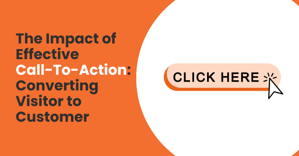
In the realm of digital marketing, minor elements frequently determine the success or failure of your initiatives. This is precisely where the Call-to-Action (CTA) becomes critical.
You may invest considerable time refining your audience targeting, crafting an attractive website, or developing compelling sales content. You could even generate substantial traffic to your landing page. However, the reality remains: all these efforts become meaningless if your audience fails to take the desired action.
A CTA might appear as merely a button, link, or brief text phrase, yet it possesses the capability to determine your campaign’s outcome.
It serves as the directional guide that instructs visitors on their next move, whether that involves downloading a resource, registering for a trial period, scheduling a consultation, or completing a transaction.
Without this guidance, individuals remain lost and uncertain about their next steps. In our current rapid-paced, distraction-heavy digital environment, even brief moments of uncertainty can result in the permanent loss of prospective customers.
Consider your CTA as the connection between interest and action. It extends beyond simply requesting a click—it involves shepherding someone forward in their relationship with your brand.
The distinction between “Submit” and “Get My Free Guide” might appear minimal, yet practically speaking, it can increase your conversions twofold. This explains why CTAs represent one of marketing’s most overlooked yet influential instruments.
Read more: Unleashing the Power of Click Marketing As PPC, CPC, and CTR

1. Understanding CTAs
A CTA, or Call-to-Action, represents a directive that instructs your audience precisely which action to take next. It might manifest as a button, text line, or visual component. Fundamentally, a CTA functions as guidance—it eliminates confusion and indicates the path forward.
Consider a website lacking CTAs: visitors may appreciate the content, yet they will ultimately depart without performing meaningful actions. Conversely, a well-defined CTA converts casual browsers into engaged participants—downloading materials, joining mailing lists, or completing transactions.
For instance, if you have encountered a button stating “Sign Up for Free,” “Shop the Collection,” or “Book Your Appointment,” you have experienced a CTA. Despite their apparent simplicity, CTAs prove powerful because they eliminate ambiguity. Rather than wondering, “What should I do next?” visitors understand precisely how to proceed.
Also read: 10 Free SEO Tools to Improve Your Digital Marketing Faster

2. The Significance of CTAs
Numerous businesses fail to recognize the influence of effective CTAs, considering them secondary concerns. In practice, however, your CTA frequently represents the distinction between someone leaving your site immediately or becoming a customer.
The reason relates to limited attention spans. Visitors will not search extensively for their next action—they anticipate your guidance. Without a CTA, you leave them speculating. When people must think extensively online, they typically select the simplest option: departing.
CTAs also affect conversions by utilizing psychological principles. Terms such as “Get,” “Discover,” or “Claim” create feelings of reward. Time-limited CTAs including “Join Today” or “Offer Ends Soon” establish urgency. Personalized CTAs, such as “Send Me My Guide,” foster ownership feelings.
Simply stated: the CTA transforms interest into commitment. You may execute excellent advertising, produce outstanding copy, or create beautiful pages—but without a strong CTA, all that effort could prove futile.
Also read: How to Convert Clicks to Customers? Guide to Optimizing Landing Pages
3. Components of Successful CTAs
Not all CTAs achieve equal effectiveness. Some motivate immediate action, while others receive no attention. What distinguishes an effective CTA?
Clarity as the priority
The most successful CTAs remain simple and straightforward. “Download Now” or “Book Your Call” surpasses ambiguous instructions like “Click Here.” People prefer not to speculate about outcomes.
Language focused on benefits
Rather than emphasizing the action itself, emphasize the advantage. “Get My Free Guide” proves significantly stronger than “Submit.” The former highlights value, while the latter feels burdensome.
Urgency and limited availability
Including time constraints or restricted access encourages faster action. Phrases such as “Only 5 Spots Left” or “Offer Ends Tonight” clarify that delay is not an option.
Visual presentation
CTAs involve more than text. Position, color, and size are equally important. A CTA button that disappears into the background becomes easily overlooked. Contrasting colors or strategic positioning (above the fold or following articles) enhances visibility.
Alignment with customer progression
First-time visitors may not be prepared for “Buy Now,” yet they might consider “Learn More” or “Get the Free Trial.” Matching your CTA to their stage develops trust and prevents overwhelming them.
The optimal results occur when these components work together. A clear message, strong advantage, urgent tone, and visible design combine to make clicking feel like the natural next step.
Also read: Create Seamless Brand Experience with Integrated Marketing
4. Frequent Errors to Prevent
Understanding what to avoid with CTAs proves equally important. These common issues reduce conversions:
Excessive generality
“Click Here” or “Submit” provides no benefit information. It appears mechanical and uninspiring.
Too many choices
When a landing page contains three or four CTAs directing different actions, visitors experience decision fatigue. Instead of selecting one option, they frequently choose none.
Requesting too much initially
Imagine viewing an advertisement for a free guide and arriving at a page requesting your complete name, email, phone number, and address before downloading. Each additional requirement decreases conversion rates. Begin modestly—obtain an email, then develop the relationship.
Poor positioning
If your CTA remains hidden at the bottom of lengthy pages without intermediate reminders, many visitors will never notice it. Strategic marketers position CTAs at crucial points: following hooks, within engaging content, and at conclusions.
By preventing these errors, you eliminate obstacles from the customer journey—resulting in more positive responses.
Also read: 10 Underrated Marketing Channels You Shouldn’t Ignore Today
5. Strong CTA Examples for Implementation
The most effective approach to understanding CTAs involves imagining discussions with your audience. Every CTA should represent the logical next step in that conversation. Let us examine four typical scenarios and how CTAs can transform the interaction.
For Free Resource Offerings
Picture this scenario: someone discovers your blog post about marketing strategies. They have found it valuable, but if they leave immediately, they may never return.
This presents the ideal opportunity to offer them a complimentary resource that strengthens their trust. Instead of using a simple “Download,” employ CTAs that feel like gifts:
- “Send me the checklist” feels like you are providing them something valuable.
- “Yes, I want the guide” gives visitors control—they are choosing rather than being instructed.
- “Claim your spot” works excellently for webinars or live events because it makes the offer appear limited.
The psychology remains straightforward: people enjoy feeling they are receiving something valuable, not performing work for you.
For Free Trial or Demo Promotion
For products or software, the objective involves reducing barriers to trial usage. Imagine someone reviewing your pricing page and they uncertain about the value. Your CTA should minimize their hesitation. Instead of simply “Start Trial,” you can reframe it:
- “Try it free for 14 days” remains clear and eliminates timing uncertainty.
- “See it in action” makes demos feel experiential rather than burdensome.
- “Explore with no commitment” reassures them they will not be obligated.
These CTAs succeed because they address underlying objections that crossed visitor’s mind (such as “Will I be charged?” or “Is this too complex?”) and replace them with reassurance.
For Purchase or Conversion Drives
At the purchasing stage, people prefer excitement about results over pressure. A generic “Buy Now” functions adequately but lacks appeal. You can frame your CTA around the outcome they will receive:
- “Get instant access” appeals to impatience—people value immediacy.
- “Upgrade my plan” makes the decision feel progressive rather than transactional.
- “Boost my results today” emphasizes benefits over payment processes.
In each instance, the CTA transcends the button—it reinforces their original motivation for visiting you.
Also read: How Social Media Management Can Help to Boost Your Company
For Learning or Exploration Encouragement
Not every visitor is prepared to purchase, and that remains acceptable. Some require additional learning before trusting you. This is where gentler CTAs excel. Instead of leaving them empty-handed, guide them deeper into your brand:
- “Discover how it works” invites curiosity.
- “Show me more” feels interactive and engaging.
- “Explore features” suggests a tour rather than a sales presentation.
These CTAs succeed because they feel pressure-free. They allow visitors to maintain control while still moving closer to your brand.
Integration Strategy
Notice how these CTAs avoid robotic language? That represents the key—they reflect genuine human thinking. Instead of stating, “Click here,” they capture emotions: curiosity, excitement, urgency, or reassurance.
By aligning your CTA with your audience’s mindset—whether they are exploring, testing, or ready to purchase—you make the next step feel natural.
Why These Examples Succeed
The common thread connecting these examples involves clarity, benefit, and action. Each one informs users exactly what will occur, highlights its importance, and uses strong action words to create momentum.
They also avoid unclear language like “Submit” or “Click Here,” which provide no genuine incentive.
When developing your own CTA, consider your page’s purpose. Are you building awareness, generating leads, or closing sales? Match your language to that objective.
If you are providing value, highlight the gift. If you are selling, highlight the outcome. If you are educating, highlight the learning ease.
Also read: 5 Metrics to Track for Measuring Google Ads Success
6. Testing and Enhancing CTAs
Even excellent CTAs can be improved. Therefore, strategic marketers continuously test variations. This process, called A/B testing, compares two versions to determine superior performance.
For example, you might test:
- “Get Started Free” versus “Start My Free Trial”
- Red buttons versus green buttons
- CTAs positioned at the top versus the bottom of pages
Over time, these minor adjustments produce significant results. Some organizations have documented double-digit conversion improvements simply by changing one word in their CTA.
Beyond testing language and design, monitor analytics. Tools such as Google Analytics or Hotjar can reveal where people click, their duration of stay, and their departure points. These insights enable continuous CTA refinement.
Turning Clicks into Customers
A CTA may appear small on a page, yet it bears significant responsibility. It represents your marketing message’s closing argument, the final encouragement that converts curious visitors into loyal customers. Every business—from e-commerce retailers to B2B service providers—depends on strong CTAs to drive growth.
Remember!
Clarity surpasses cleverness, benefits surpass features, and urgency surpasses hesitation. Whether you are requesting downloads, purchases, or exploration, your CTA should always make the next step obvious and compelling.
Therefore, when crafting your next landing page or email campaign, avoid treating the CTA as an afterthought button. Consider it your strategy’s heartbeat, because when executed correctly, it can transform everything.
Also read: Launch Your Facebook Ads Campaign Without Wasting Budget
