The Psychology Behind High-Converting Landing Pages

In the fast-paced world of digital marketing, your landing page represents the crucial moment where potential customers decide whether to trust your brand or click away forever.
It’s the digital equivalent of a first date – you have one chance to make an impression that either sparks interest or sends them running.
Consider this sobering reality: businesses spend thousands of dollars driving traffic through Google Ads, Facebook campaigns, influencer partnerships, and SEO optimization.
Yet despite all this investment in getting people to their landing page, the average conversion rate across industries hovers around just 2.35%. This means that out of every 100 visitors who land on your page, 97 will leave without taking any action.
The difference between a landing page that converts at 2% versus one that converts at 15% isn’t luck, better graphics, or a more expensive designer. It’s psychology – understanding how the human brain processes information, makes decisions, and responds to different stimuli.
A high-converting landing page isn’t just aesthetically pleasing or functionally sound. It’s strategically designed to align with the way our minds work – tapping into cognitive biases, emotional triggers, and behavioral patterns that have been hardwired into us over thousands of years of human evolution.
Throughout this comprehensive guide, we’ll dive deep into the psychological principles that separate high-performing landing pages from those that struggle to convert.
More importantly, you’ll learn exactly how to implement these insights to transform your own landing pages into powerful conversion machines that turn casual browsers into engaged leads, loyal subscribers, and paying customers.
Also read: The Small Business Guide to Lead Generation That Works

1. First Impressions:
You Have 5 Seconds to Win or Lose
Research from the Missouri University of Science and Technology reveals that it takes just 2.6 seconds for a user’s eyes to land on the area of a website that most influences their first impression.
Within the first 5 seconds, visitors have already formed a judgment about your credibility, trustworthiness, and whether your offering is worth their time.
This isn’t just about making things look pretty – it’s about cognitive processing.
During those crucial first moments, your visitor’s brain is rapidly scanning for pattern recognition, threat assessment, and relevance evaluation. They’re subconsciously asking: “Is this what I expected? Does this solve my problem? Can I trust this?”
💡 Psychological Principle: Cognitive Ease and the Mere Exposure Effect
Our brains are essentially lazy – they prefer information that’s easy to process and understand. Psychologist Daniel Kahneman calls this “cognitive ease” – when information feels familiar and effortless to comprehend, we’re more likely to trust it and act on it.
When a landing page is visually cluttered, has confusing navigation, or uses jargon-heavy language, it creates what psychologists call “cognitive load.”
The brain has to work harder to understand what’s being presented, which triggers a stress response. Rather than expend that mental energy, most visitors will simply leave.
Additionally, the mere exposure effect shows that we tend to develop preferences for things we’re familiar with. This is why successful landing pages often use familiar design patterns, conventional button colors, and recognizable layouts – they feel “safe” to the brain.
Let’s examine two different approaches for a meditation services landing page:
Poor Example:
– Headline: “Revolutionary Mindfulness Solutions for Modern Professionals”
– Cluttered with multiple CTAs: “Download App,” “Learn More,” “View Pricing,” “Contact Us”
– Hero image: Abstract geometric patterns
– Small text explaining features and benefits
– Multiple pop-ups and notification bars

High-Converting Example:
– Headline: “Finally, Get Better Sleep in Just 10 Minutes a Day”
– Single, prominent CTA: “Start Free Trial”
– Hero image: Peaceful person sleeping soundly in a minimalist bedroom
– Subheadline: “Join 500,000+ people who’ve transformed their sleep with our guided meditation app”
– Clean, spacious layout with plenty of white space

The successful version works because it immediately communicates a clear benefit (better sleep), addresses a specific timeframe (10 minutes), and uses familiar imagery that emotionally resonates with the target audience. The single CTA eliminates decision fatigue, while the social proof number provides instant credibility.
Thus, here are the tips to create your fine landing pages:
Headline Optimization:
– Use benefit-driven headlines that answer “What’s in it for me?” within 3-5 words
– Include specific numbers, timeframes, or outcomes: “Lose 10 Pounds in 30 Days” rather than “Get Fit”
– Test headlines using the “so what?” test – if someone could respond “so what?” to your headline, it’s too vague
Hero Image Strategy:
– Choose images that emotionally represent the end result, not the process
– Use faces when possible – humans are naturally drawn to other faces
– Ensure your hero image supports and reinforces your headline message
– Avoid generic stock photos that could apply to any business
Visual Hierarchy and Layout:
– Use the “5-second rule” – show your page to someone for 5 seconds and ask what they remember
– Implement the Z-pattern or F-pattern layout that matches natural eye movement
– Create contrast between your CTA button and background (aim for a 3:1 contrast ratio minimum)
– Use white space strategically to draw attention to key elements
Also read: Top 10 Skills Required for Digital Marketing Career

 2. Social Proof: We Follow the Crowd
Humans are inherently social creatures. For thousands of years, following the group meant survival – those who strayed from the tribe faced danger and isolation.
This evolutionary programming still influences our decision-making today, especially in uncertain situations like encountering a new brand or product.
When visitors land on your page, they’re essentially asking themselves: “Is this legitimate? Have people like me had success with this? What will others think if I make this choice?” Social proof helps answer these questions by showing that others have already made the leap and benefited from it.
💡 Psychological Principle: The Bandwagon Effect and Social Validation
The bandwagon effect is our tendency to do or believe things because many other people do or believe the same. It’s closely related to social validation – we look to others’ behavior to guide our own actions, especially when we’re uncertain about what to do.
Dr. Robert Cialdini’s research shows that social proof is most effective when it’s specific, relevant, and comes from people similar to the target audience.
Generic testimonials from unnamed sources carry little weight, while detailed reviews from identifiable people in similar situations can be incredibly persuasive.
Consider a landing page for an online business course targeting freelancers:
Weak Social Proof:
– “Great course! Highly recommended.” – Anonymous
– “5 stars”
– “Thousands of satisfied students”

Powerful Social Proof:
- Specific testimonials: “This course helped me land my first $5,000 client within 3 weeks. The pricing strategies in Module 4 alone were worth the entire investment.” – Sarah Chen, Freelance Web Designer, San Francisco
- Detailed case studies: “Meet Marcus, a graphic designer who went from $30/hour to $125/hour in 6 months using our client acquisition system”
- Recognizable authority: Logos of companies like Microsoft, Adobe, and Shopify with the caption “Our graduates now work with”
- Real-time social proof: “1,247 freelancers joined this month” or “Jessica from Portland just enrolled 3 minutes ago”
- Specific statistics: “Average income increase: 156% within 6 months” with a small disclaimer explaining the methodology
- Â

Video testimonials: Short 30-60 second videos featuring real students discussing specific transformations, challenges overcome, and results achieved
Now that you know how to make a good testimony in landing pages, here’s what you can do for the section in your website:
Testimonial Optimization:
– Include specific outcomes, numbers, and timeframes in testimonials
– Use photos of real people (not stock photos) with full names and relevant job titles
– Address common objections within testimonials: “I was skeptical at first, but…”
– Create video testimonials for higher impact – they’re harder to fake and more emotionally compelling
Strategic Social Proof Placement:
– Place social proof above the fold, near your headline
– Use testimonials that directly relate to your CTA: if you’re asking for email signups, show testimonials about the value of your email content
– Include social proof near potential friction points, like pricing or contact forms
Types of Social Proof to Consider:
– Wisdom of crowds: “Join 50,000+ marketing professionals”
– Wisdom of friends: “Your colleague Jennifer recommended this”
– Certification/authority: “As featured in Forbes, TechCrunch, and Entrepreneur”
– User-generated content: Screenshots of social media posts praising your product
– Expert endorsements: Quotes from industry leaders or influencers
Also read: 4 Impactful Tips to Kickstart your Digital Marketing Career

3. The Power of One: Focus on One Clear Goal
One of the most critical yet overlooked aspects of landing page psychology is the paradox of choice. While we think giving visitors more options will increase conversions, research consistently shows the opposite. When faced with too many choices, people experience decision paralysis and often choose to do nothing at all.
Psychologist Barry Schwartz’s research on “The Paradox of Choice” demonstrates that while some choice is better than none, too many options can lead to anxiety, decision avoidance, and decreased satisfaction even when a choice is eventually made.
Psychological Principle: Choice Overload and Decision Fatigue
Choice overload occurs when people are presented with so many options that the effort required to make a decision becomes overwhelming. This is compounded by decision fatigue – the deteriorating quality of decisions made after a long session of decision-making.
Every element on your landing page that isn’t directly supporting your primary conversion goal is essentially asking visitors to make another micro-decision: “Should I click this? Should I read this? Should I explore this other option?” Each decision depletes their mental energy and increases the likelihood they’ll abandon the page.
Then, how you achieve your goal in the form of landing pages website design? See the differences below:
Unfocused Approach (Multiple Goals):
– Three different CTAs: “Schedule,” “View Portfolio,” “Download Design Guide”
– Social media icons prominently displayed
– Newsletter signup form
– Links to recent blog posts
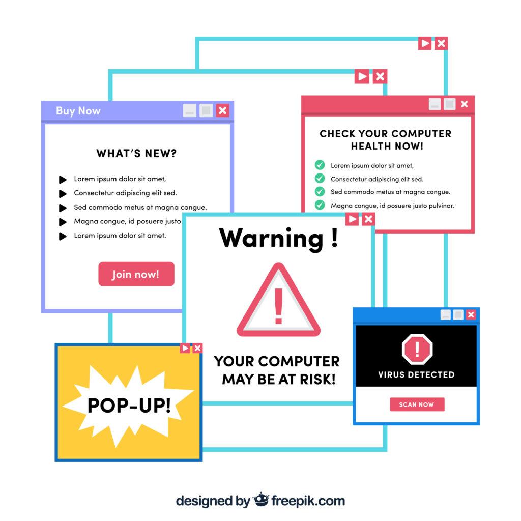
– Pop-up offering a discount on products

Focused Approach (Single Goal):
– Single, prominent CTA: “Schedule Your Free Services Today”
– All copy emphasizes the value of the products/services
– Social proof specifically about consultation results
– Even the contact information is presented as “Ready to schedule? Call or use the form below”

The focused approach works because every element reinforces the same message and action. There’s no cognitive competition – visitors don’t have to decide between downloading a guide or booking a consultation because only one option is presented.
If you unsure on how to present your goals, these are the tips for you:
Goal Definition and Alignment:
– Define your single, primary conversion goal before designing anything
– Audit every element on your page and ask: “Does this support my primary goal?”
– Remove or minimize elements that don’t directly contribute to conversion
– If you must include secondary options, make them significantly less prominent
CTA Optimization:
– Use the same CTA button text and color throughout the page
– Place your primary CTA above the fold and repeat it after key sections
– Make your CTA button large enough to be easily clickable (min. 44×44 px)
– Use action-oriented language that creates urgency: “Get Started Now” vs. “Submit”
Navigation Strategy:
– Consider removing main navigation entirely on dedicated landing pages
– If navigation is necessary, limit it to 3-5 essential items
– Use breadcrumbs or progress indicators for multi-step processes
– Ensure your logo links back to your main site, not the landing page
Content Flow:
– Structure content to naturally lead toward your CTA
– Use transitional phrases that guide readers: “Now that you understand the problem, here’s the solution…”
– End each section with a micro-CTA or transition to the next section
– Create a progression: Problem → Solution → Benefits → Social Proof → CTA
Also read: Unleashing the Power of Click Marketing As PPC, CPC, and CTR

4. Urgency and Scarcity: Tap into the Fear of Missing Out
Human beings are naturally loss-averse – we’re more motivated by the fear of missing out on something than by the prospect of gaining something new.
This psychological principle, first identified by behavioral economists Daniel Kahneman and Amos Tversky, explains why urgency and scarcity tactics can be incredibly effective when used authentically.
The key word here is “authentically.” While fake countdown timers and manufactured scarcity might provide short-term conversion boosts, they damage trust and can harm your brand’s long-term credibility.
Psychological Principle: Loss Aversion and the Scarcity Effect
Loss aversion refers to our tendency to prefer avoiding losses over acquiring equivalent gains. In practical terms, the pain of losing $100 is psychologically twice as powerful as the pleasure of gaining $100.
The scarcity effect shows that we place higher value on things that are less available. When something is scarce, we assume it’s more valuable, desirable, or important. This is why limited-time offers, exclusive access, and restricted quantities can be so motivating.
Authentic Urgency Creation:
– Use real deadlines tied to actual events (product launches, course start dates, seasonal promotions)
– Explain the reason behind the urgency: “We’re limiting enrollment to ensure quality interaction during our live Q&A sessions”
– Show consequences of waiting: “The price increases by $200 after early bird registration closes”
– Use behavioral urgency: “It typically takes our clients 3-6 months to see these results when they implement immediately”
Scarcity Tactics That Build Trust:
– Display real inventory numbers that actually decrease: “Only 23 spots left in this month’s cohort”
– Use access-based scarcity: “Exclusive to our first 100 beta users”
– Create time-based exclusivity: “Available only during our launch week”
– Implement tier-based scarcity: “VIP pricing available for the next 50 customers”
Visual and Copy Techniques:
– Use contrasting colors for urgency elements (red, orange, yellow)
– Include countdown timers that display days, hours, minutes, and seconds
– Use phrases like “Don’t miss out,” “Limited time,” “Exclusive opportunity,” “Only available until…”
– Add urgency to your CTA buttons: “Secure My Spot Before It’s Gone”
– Include testimonials that reference the urgency: “I’m so glad I didn’t wait – this transformed my business immediately!”
Also read: Thriving the Digital Marketing Landscape: Trends and Tactics

5. Lead with Emotion, Justify with Logic
Contrary to what many marketers believe, purchasing decisions are primarily emotional, not logical.
Neuroscientist Antonio Damasio’s research with patients who had damage to the emotional centers of their brains revealed that while they could process logical information perfectly, they struggled to make even simple decisions.
This doesn’t mean people are irrational – it means emotions serve as the initial filter for decision-making, while logic provides the justification for choices we’ve already made emotionally.
Psychological Principle: Emotional Resonance and Cognitive Dissonance
Emotional resonance occurs when your message connects with your audience’s feelings, desires, fears, or aspirations. When people feel emotionally connected to your message, they’re more likely to pay attention, remember your content, and take action.
Cognitive dissonance theory explains why people need logical justification for their emotional decisions. After making an emotional choice, people experience discomfort if they can’t logically explain their decision to themselves or others. Providing rational reasons helps resolve this dissonance and reinforces their choice.
Emotional Triggers to Leverage:
– Fear of missing out: “While others struggle with low energy, you’ll wake up refreshed and ready”
– Desire for transformation: “Imagine walking into your high school reunion feeling better than you did at 18”
– Frustration with current state: “Tired of starting Monday with good intentions, only to give up by Wednesday?”
– Aspiration and identity: “Join the thousands of professionals who’ve made their health a priority”
– Social acceptance: “Finally feel confident in photos with your family”
Storytelling Techniques:
– Use the “before, during, after” narrative structure
– Include sensory details: “Feel the satisfaction of buttoning pants that haven’t fit in years”
– Create relatable scenarios: “You know that 3 PM energy crash? Imagine having steady energy all day long”
– Use “future pacing”: Help visitors visualize themselves experiencing the benefits
Logical Justification Elements:
– Scientific backing: “Based on research from the Journal of Applied Psychology”
– Specific outcomes: “Average weight loss of 23 pounds in 12 weeks”
– Risk reduction: “30-day money-back guarantee”
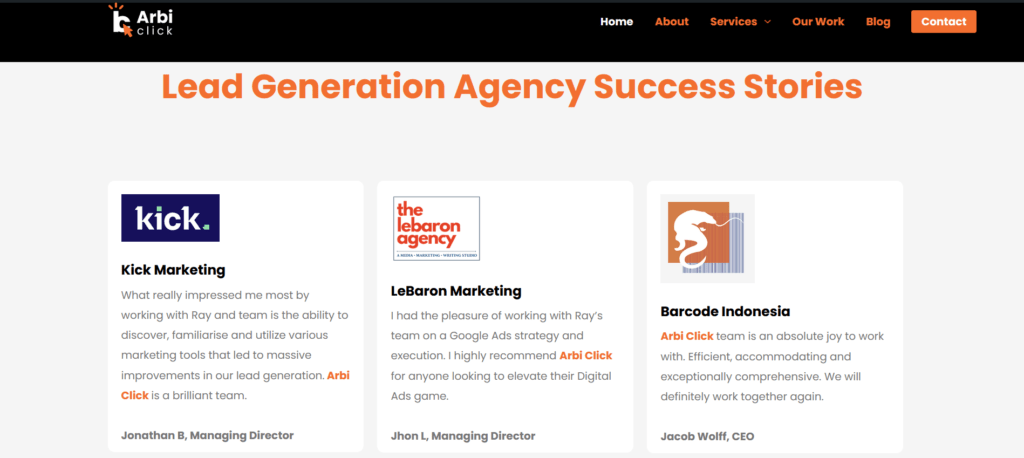
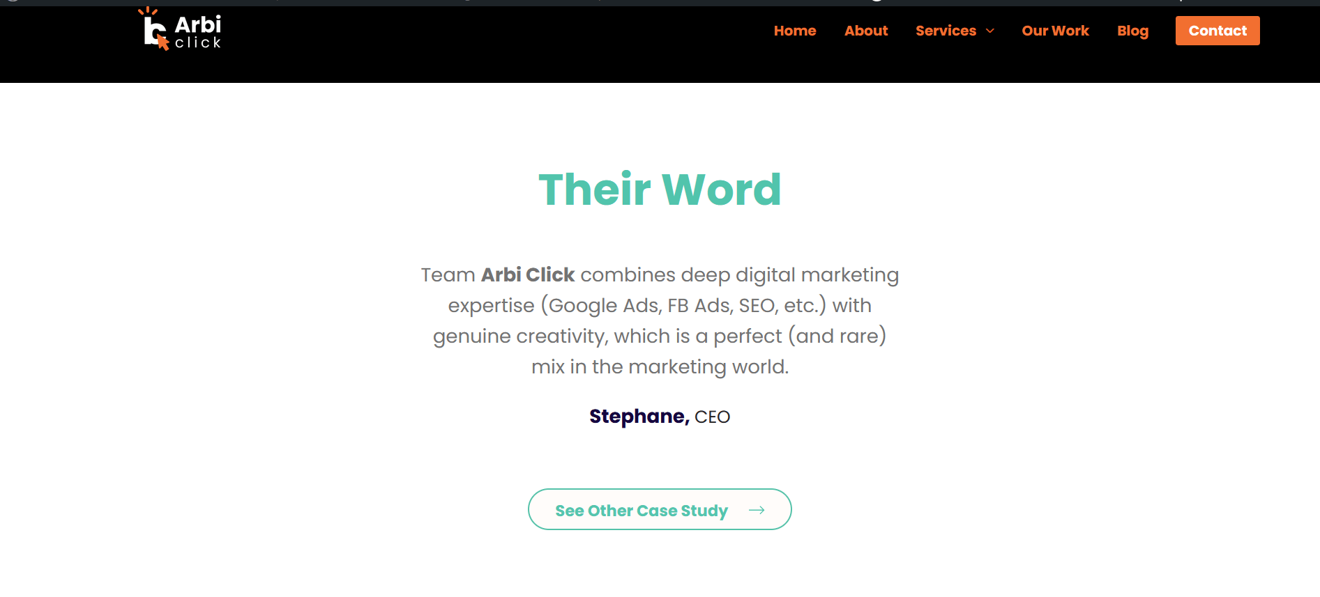
– Social proof: “Trusted by 10,000+ busy professionals”
– Authority: “Developed by certified trainers with 15+ years of experience”
Also read: How to Master Google Ads for Digital Marketing Success?

 6. Visual Flow and Direction: Guide the Eye
The human eye doesn’t randomly scan a webpage – it follows predictable patterns based on how we’ve learned to read and process visual information.
Understanding these patterns allows you to create a visual hierarchy that guides visitors through your content in a logical sequence that builds toward conversion.
Eye-tracking studies have revealed specific patterns in how people scan web pages, with the most common being the F-pattern (for text-heavy pages) and the Z-pattern (for more visual, landing page-style layouts).
Psychological Principle: Directional Bias and Visual Hierarchy
Directional bias refers to our tendency to follow visual cues that point in a specific direction.
Our brains are wired to notice and follow arrows, lines, gazes, and other directional elements. This is an evolutionary adaptation that helped our ancestors quickly identify threats and opportunities in their environment.
Visual hierarchy is about organizing elements so that the most important information is noticed first, creating a clear path from initial attention to desired action.
You can follow this guide to make your website design visual appealing:
Directional Cues:
– Use arrows, chevrons, and lines to point toward important elements
– Position faces and bodies to “look at” your CTA or key information
– Create implied lines through alignment and spacing
– Use color gradients that flow toward conversion elements
Reading Pattern Optimization:
– Structure content to match F-pattern or Z-pattern eye movement
– Place most important information in the upper left corner (where eyes typically start)
– Use the “golden ratio” or “rule of thirds” for element placement
– Create visual breaks between sections to prevent cognitive overload
Color and Contrast Strategy:
– Use warm colors (reds, oranges) for action elements
– Implement high contrast for important elements (minimum 4.5:1 ratio)
– Use color psychology: blue for trust, green for growth, red for urgency
– Ensure sufficient contrast for accessibility compliance
– Make sure it’s optimized in tablet and mobile view
White Space Utilization:
– Use white space to draw attention to key elements
– Create breathing room around important information
– Separate different sections to improve comprehension
– Balance content density with readability
Also read: 10 Underrated Marketing Channels You Shouldn’t Ignore Today

7. Make the CTA Feel Easy, Safe, and Rewarding
Your call-to-action (CTA) is the moment of truth – where psychological preparation meets actual conversion. A well-crafted CTA doesn’t just tell people what to do; it makes them want to do it by addressing their subconscious concerns about risk, effort, and value.
Research shows that changing a single word in your CTA can increase conversions by 90% or more. This isn’t about magic words – it’s about understanding the psychological barriers that prevent people from taking action.
Psychological Principle: Risk Aversion and Friction Reduction
Risk aversion is our natural tendency to avoid potential losses, even when the potential gains outweigh the risks. When faced with a CTA, visitors quickly assess three things: How much effort is required? What could go wrong? What’s in it for me?
Friction refers to anything that makes the conversion process feel difficult, uncertain, or risky. Reducing friction isn’t just about making forms shorter – it’s about addressing psychological barriers that create hesitation.
Word Choice Psychology:
– Use action verbs that create momentum: “Discover,” “Unlock,” “Transform,” “Accelerate”
– Include benefit-focused language: “Get,” “Receive,” “Access,” “Claim”
– Add urgency when appropriate: “Reserve,” “Secure,” “Grab”
– Personalize with “My” or “Your”: “Start My Trial” vs. “Start Trial”
Microcopy Strategy:
– Address common objections directly: “No spam, ever” or “Cancel anytime”
– Provide process clarity: “Takes 2 minutes” or “Instant access”
– Reduce perceived risk: “Free forever” or “No credit card required”
– Add social proof: “Join 50,000+ users” or “Trusted by professionals”
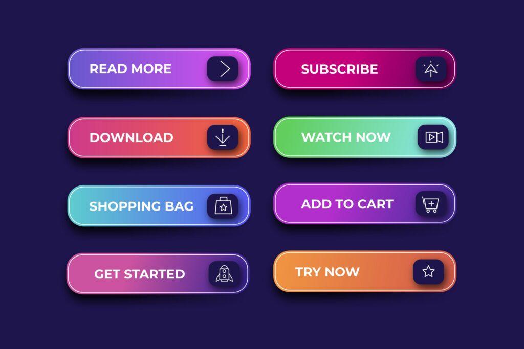
Visual CTA Optimization:
– Size: Make buttons large enough to be easily clickable (min. 44×44 px)
– Color: Use colors that contrast with your page background
– Shape: Rounded corners often feel more friendly than sharp edges
– Placement: Position CTAs where they feel natural in the content flow
– Repetition: Include your primary CTA 3-5 times throughout longer pages
Form Optimization:
– Minimize required fields to only essential information
– Use progressive disclosure for complex forms
– Include helpful placeholder text and validation messages
– Offer social login options to reduce friction
– Show progress indicators for multi-step processes
Also read: 10 Tips for Effective Digital Marketing

Final Thoughts: Design for the Mind, Not Just the Click
Creating a high-converting landing page isn’t about manipulating people into making decisions they’ll regret. It’s about understanding human psychology well enough to remove barriers, reduce friction, and present your offer in a way that feels natural, trustworthy, and valuable.
The principles we’ve explored – from first impressions to emotional resonance to visual flow – work because they align with how our brains are naturally wired to process information and make decisions.
When you design with psychology in mind, you’re not tricking people into converting; you’re making it easier for them to say “yes” to something that genuinely benefits them.
Remember that conversion optimization is an ongoing process. What works for one audience might not work for another. The key is to understand these psychological principles and then test, measure, and refine your approach based on real data from your specific audience.
Key Takeaways for Implementation:
- Start with empathy, not strategy. Before you write a single word or choose a color, deeply understand your audience’s fears, desires, and motivations.
- Prioritize clarity over cleverness. Your landing page should communicate value immediately and unmistakably.
- Test one element at a time. Change your headline, your CTA, or your social proof – but not all at once. This way, you’ll know what actually drives results.
- Measure what matters. Conversion rate is important, but also track engagement metrics, bounce rate, and time on page to understand the full user experience.
- Think mobile-first. More than half of your visitors will likely be on mobile devices. Ensure your psychological principles translate to smaller screens.
The most successful landing pages feel almost effortless to use. Visitors don’t have to think hard about what to do next – the path forward feels obvious and appealing.
This seeming simplicity is actually the result of sophisticated psychological understanding applied to user experience design.
So the next time you sit down to create or optimize a landing page, don’t just ask “What do I want them to do?” Ask “What would make this feel easy, obvious, and exciting for them?” That shift in perspective – from your needs to their experience – is where true conversion optimization begins.
When you combine compelling value propositions with psychological insight, you create landing pages that don’t just convert – they create positive experiences that build trust, generate word-of-mouth referrals, and lay the foundation for long-term customer relationships.
Also read: 5 Metrics to Track for Measuring Google Ads Success

Need Help Crafting a Landing Page That Converts?
Creating a psychologically optimized landing page requires both strategic thinking and detailed execution. If you’re struggling with a landing page that’s not generating the results you need, professional copywriting and conversion optimization support can make all the difference.
Whether you need help crafting compelling headlines, optimizing your call-to-action copy, restructuring your content flow, or implementing advanced psychological principles, experienced conversion copywriters can transform your page into a lead-generating powerhouse.
From comprehensive landing page audits to complete rewrites, conversion-focused copywriting services can help you:
– Identify psychological barriers preventing conversions
– Craft emotionally resonant headlines and copy
– Optimize your CTAs for maximum click-through rates
– Implement advanced social proof strategies
– Create urgency and scarcity that builds trust
– Design visual flows that guide visitors to conversion
Ready to transform your landing page performance?
Consider partnering with a conversion copywriting specialist who understands both the psychology of persuasion and the technical aspects of optimization. The right expertise can turn your struggling landing page into your most powerful marketing asset.
Contact Us for a free mini-audit and personalized recommendations to boost your landing page performance!
